SeniorConnect USA
An accessibility-first brand and content system that helps Americans over 50 choose internet and the home services around it — designed so the brand decision and the usability decision are never two different decisions.
The approved lockup. The mark is a walking cane that doubles as a signal-strength climb — the two ideas the brand has to hold at once, in one geometry.
A buying decision the web routinely under-designs
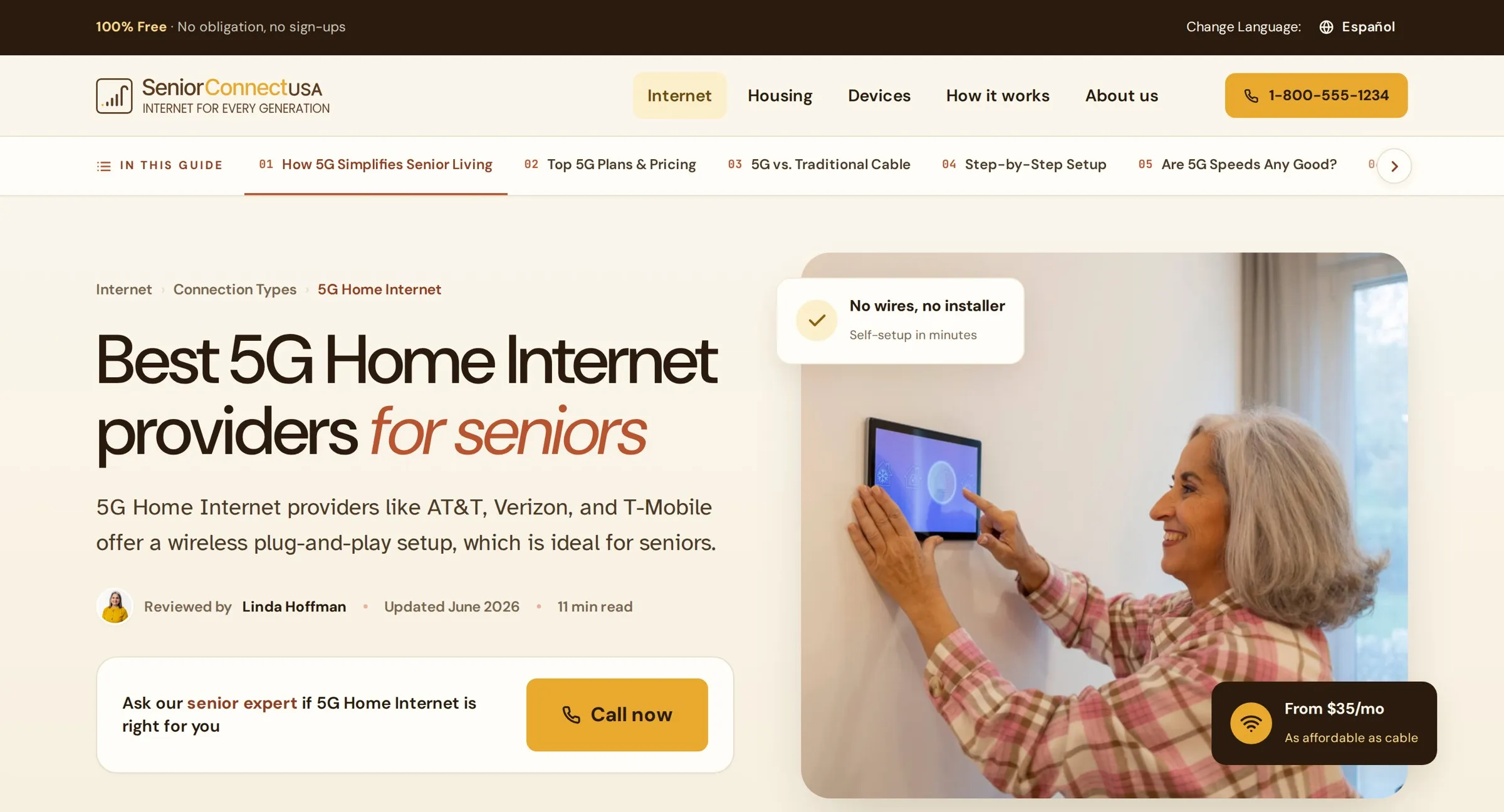
SeniorConnect helps Americans over 50 compare and choose home internet — and the services around it: housing, devices, and daily life — without needing a grandchild on the phone. It is an editorial, lead-generation product: the business runs on people reaching the right provider and acting, so every page is both a guide and a conversion surface. And the operator is specific — older, often low-vision, imprecise on touch, phone-first, with little patience for telecom jargon, and frequently in a bilingual household. Design for that operator or the page fails silently.
I receive a content brief. I ship an experience.
For each provider or page the requirement arrives as content — a meta title, hero copy, section-by-section text, pricing, a call to action. That is the raw material, not the design. The reframe is the whole job: a requirement is a list of facts; my work is turning it into a page a 72-year-old can act on at a glance — deciding the information architecture, the reading order, the trust signals, the right component for every block, and where the single unmissable action lives.
- Meta title & description
- Hero headline + paragraph
- Section copy, in order
- Starting price + offer terms
- “TFN or Check Availability”
- Architecture & reading order
- The component for every block
- Trust signals & review byline
- Price as type, never a button
- One unmissable action, phone-first
Low vision, imprecise taps, zero patience for jargon
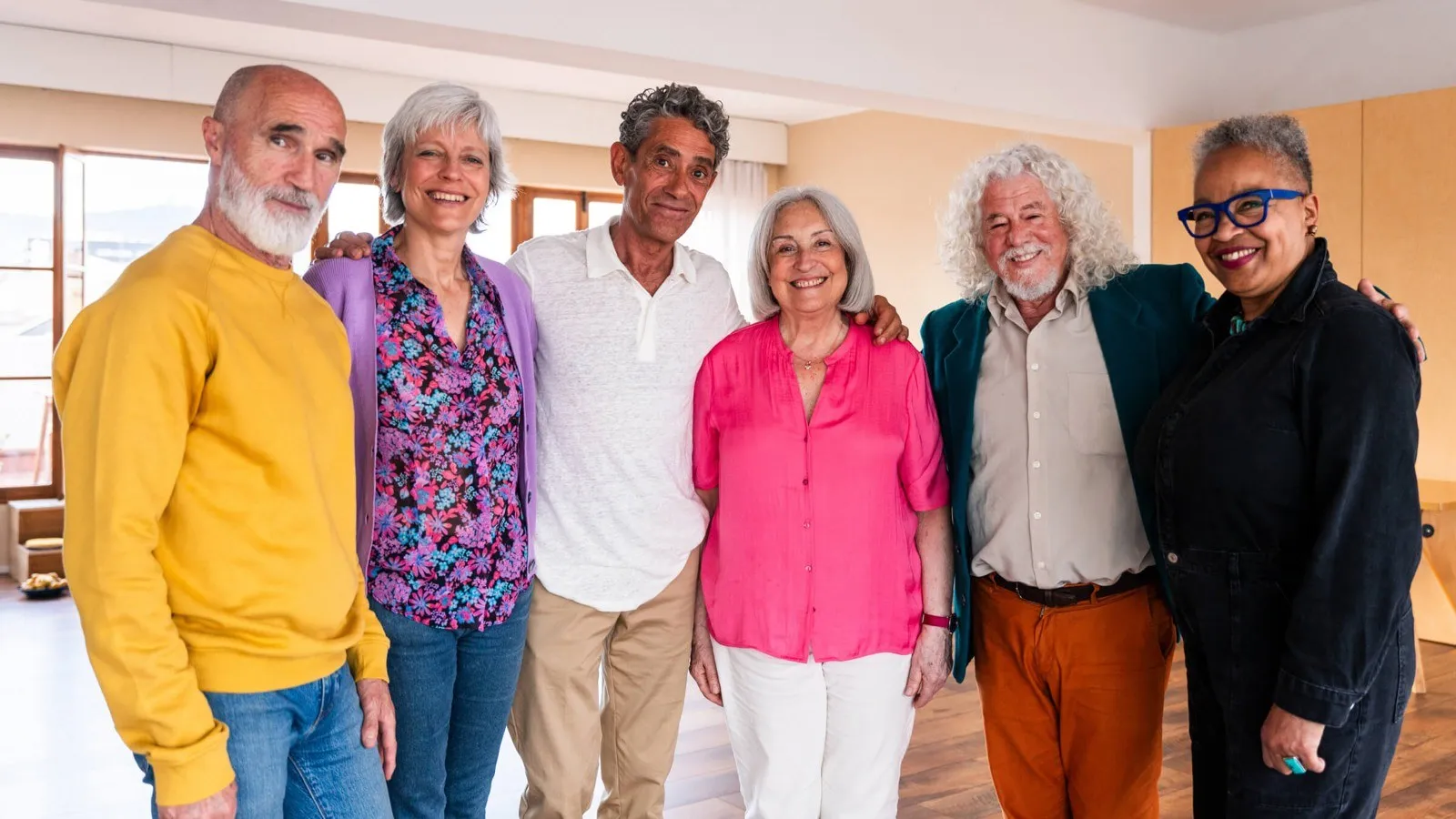
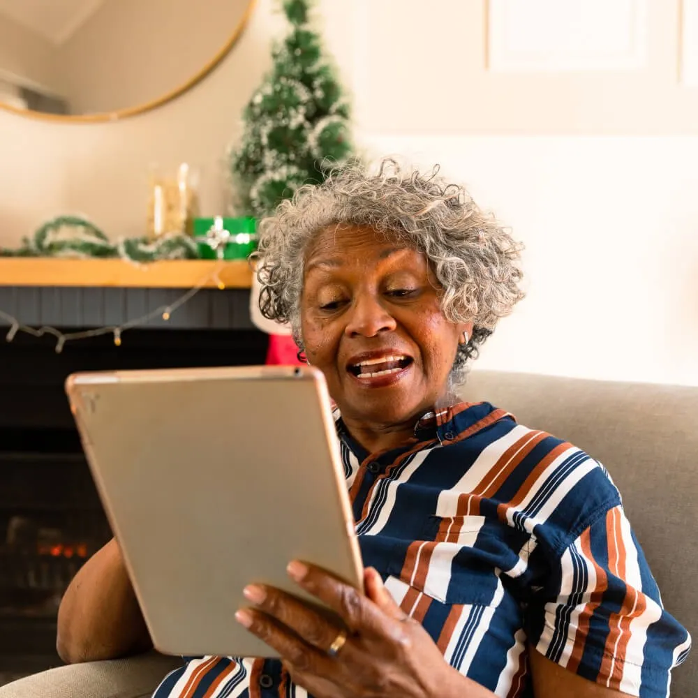
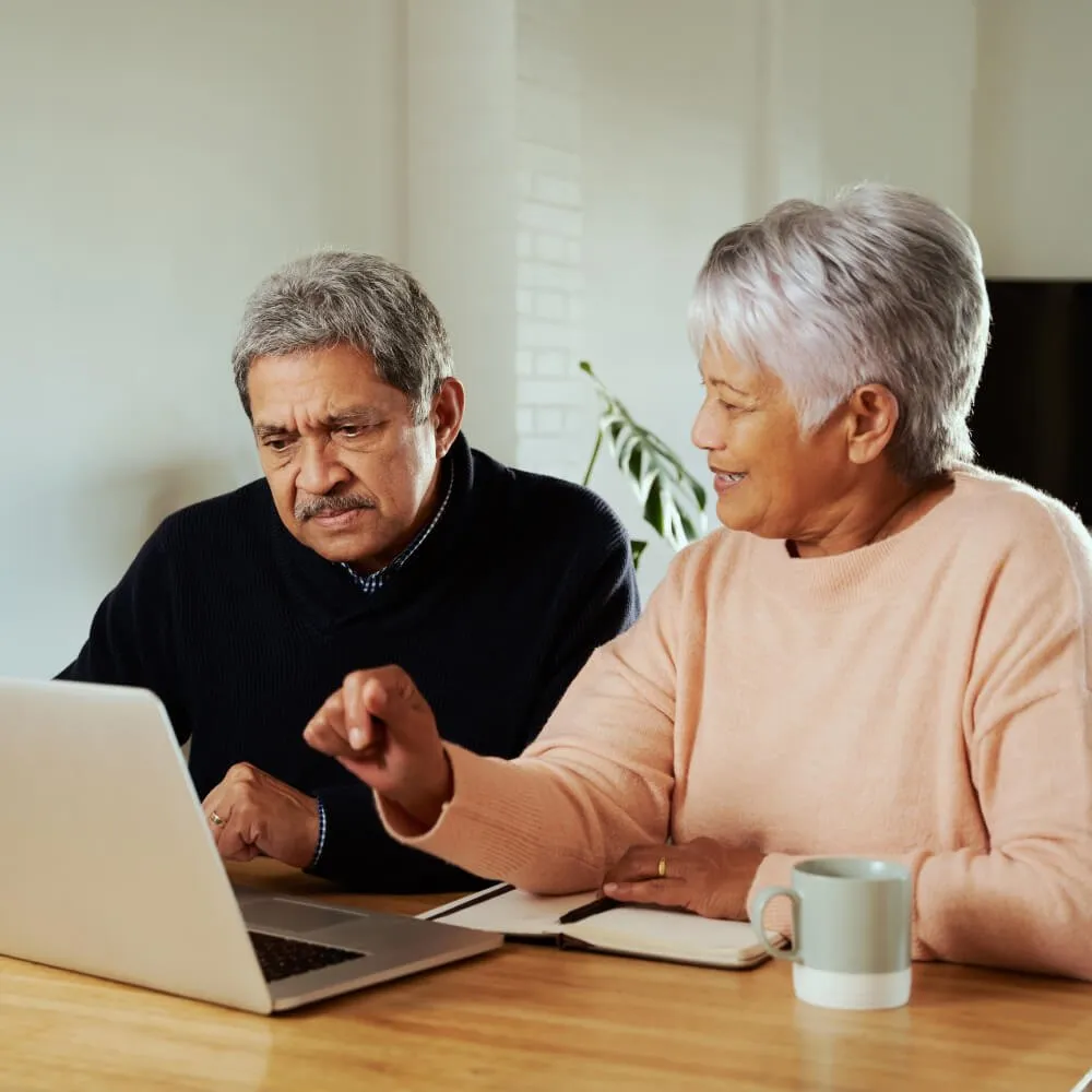
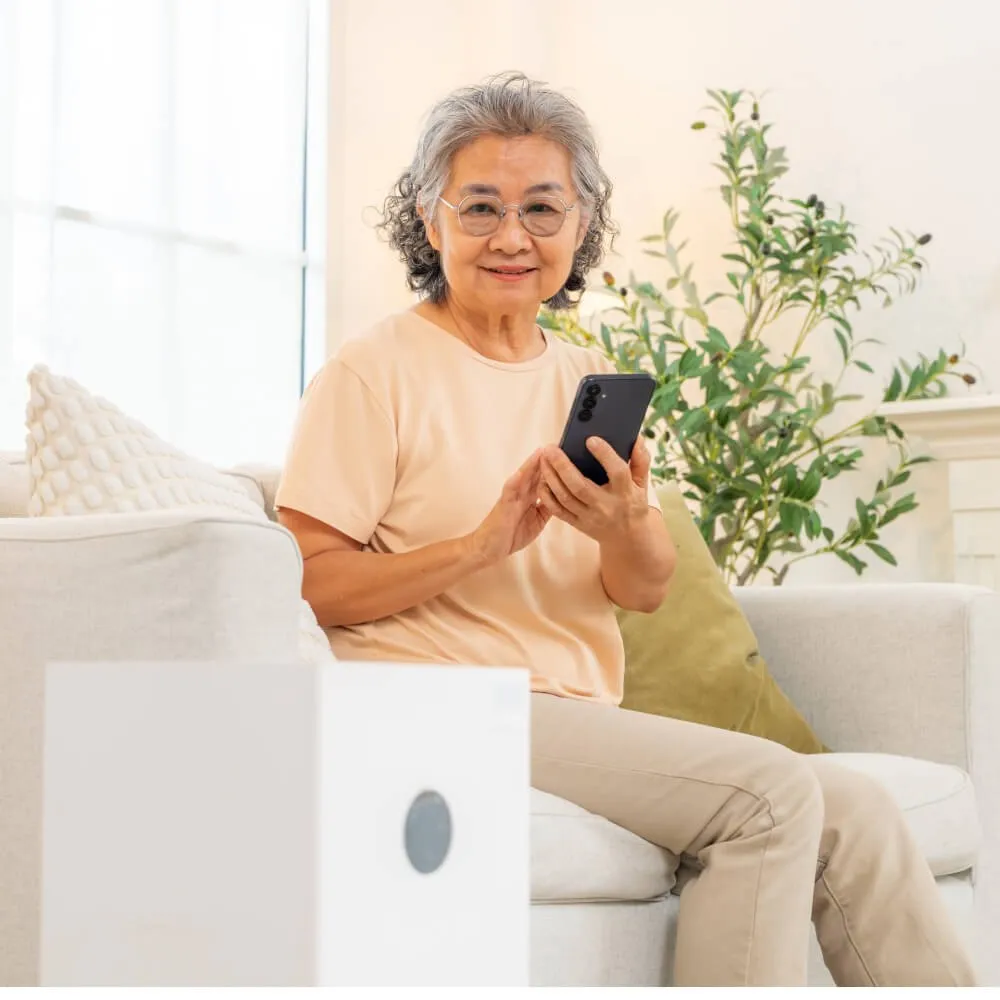
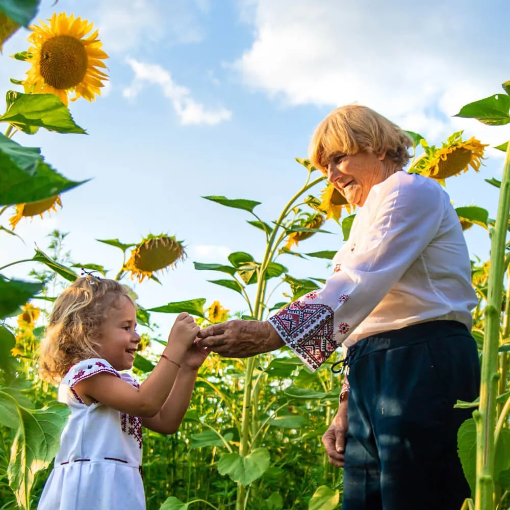
The audience defines the constraints, not the other way around: text that holds up for aging eyes, targets sized for an unsteady tap, plain language in place of telecom marketing, and a phone number a real person answers — because this audience still calls. The research that mattered most was about who appears on the page. Inclusion here isn't decoration; it is the editorial spine. The photography direction is explicit: real seniors, active aging only, diverse on every dimension — Black, Latino, Asian, Indigenous, white; mixed couples; wheelchair users, hearing aids, glasses. The filter I wrote for it: if it could be on the cover of Real Simple, not a brochure — use it.
The honest line on numbers: this is a live, ongoing build without a controlled A/B cohort yet. The validation so far is an accessibility floor every page must clear, plus structured iteration — not a conversion lift I can't substantiate. Where a real number can't be earned, the case study doesn't invent one.
Every page is wireframed, then built as a working page
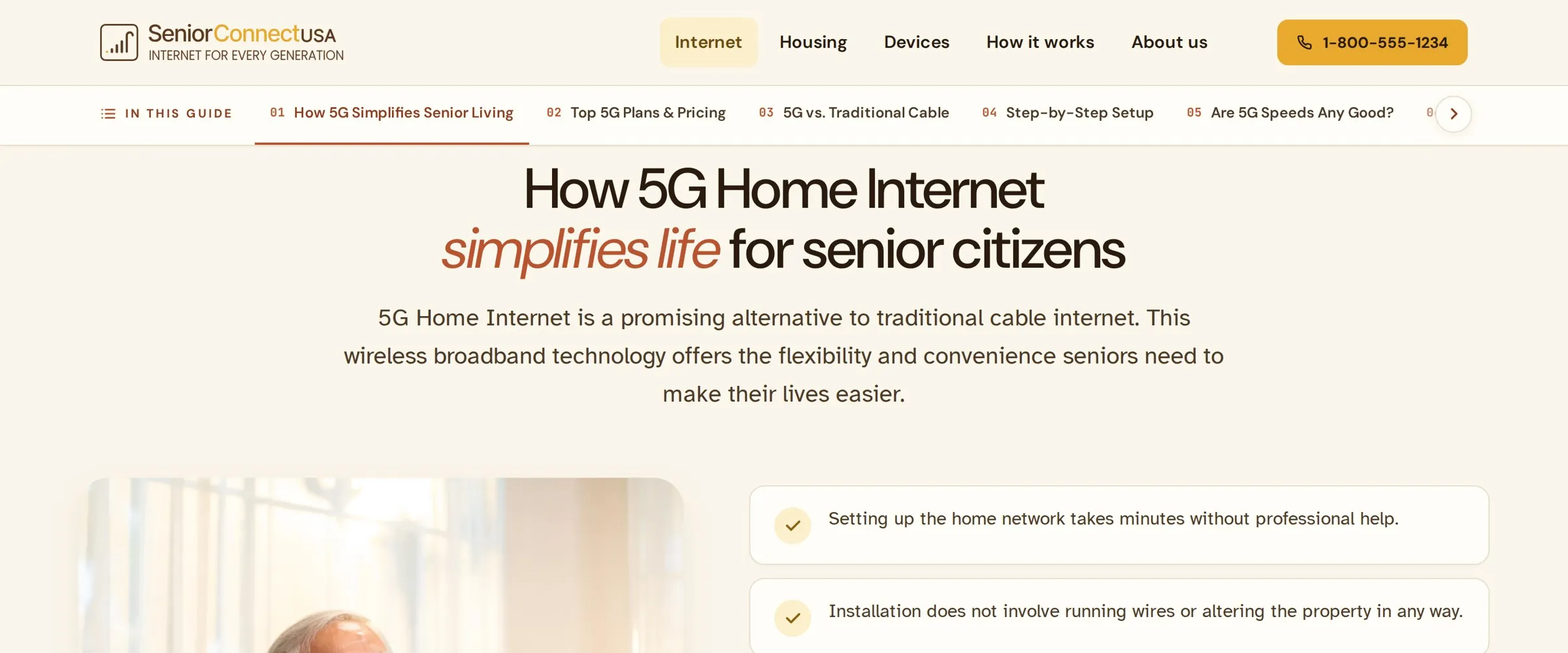
Each page moves wireframe → high-fidelity → live HTML. The prototypes aren't flat comps; they're real responsive pages, so the layout is pressure-tested in a browser at the sizes seniors actually use. Two IA decisions earn their keep on long pages: a persistent“In this guide” table of contents so nobody gets lost, and a plain-language “what does this mean for seniors?” read on every dense topic.
A standards doc written from mistakes, not theory
The system didn't arrive clean. It carries a “rules learned” document — corrections caught in review and written down so they can't recur. The pattern in each one is the same: the comfortable default was quietly an accessibility risk for this audience.
Eyebrows, not pills
A label set as a rounded chip with a dot reads as something to tap. Labels are a typographic kicker with a short dash rule instead — a 72-year-old should never try to press a heading.
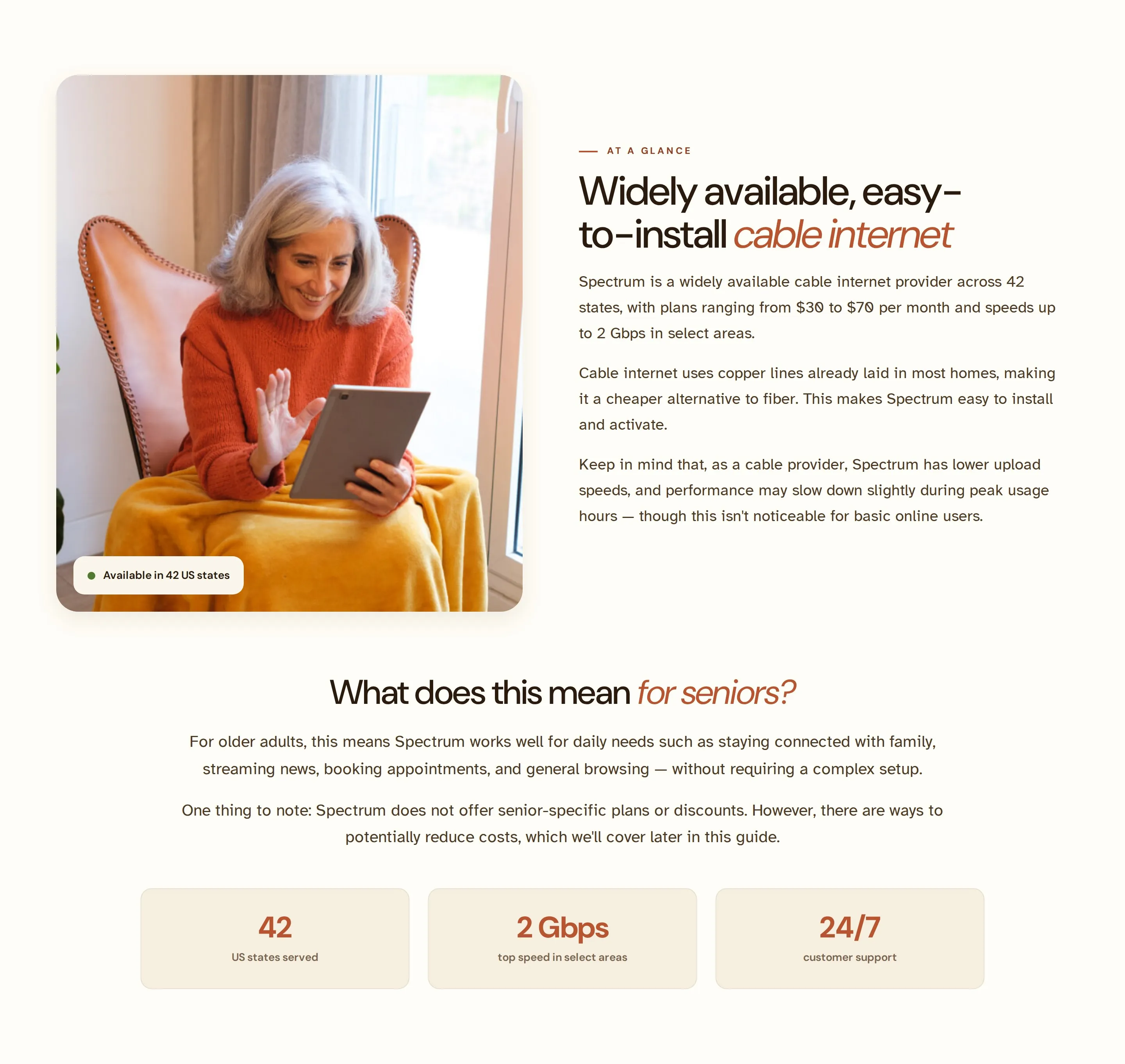
Prices are typography, not boxes
A price wrapped in a bordered card looks like a button. Pricing is set as plain text — small label, large amount, fine print — so the most important number is never mistaken for a target.
One button behaviour, everywhere
No hand-rolled lighten-and-lift hovers. Every button behaves identically to the plan card's “Check availability.” For this operator, predictability is an accessibility feature.
Imagery needs air; lead with diversity
Photos never touch a section's edge, and never lean on dated props — no holiday lights, no antique phones. The hero leads with diversity because the first face sets who this is for.
An earlier direction — “Calm Clinic” — was clinically calm but cold. It was reframed into “Sunlit Porch”: the same senior-first foundations (generous type, calm contrast, big targets) recoloured around sunflower and terracotta. Domestic, optimistic, unmistakably warm — a porchlight on every page instead of a waiting room.
Sunlit Porch — where the brand is the accessibility
One system holds the brand and the usability as a single decision. It sits on a senior-first floor, and every brand choice has to clear that floor before it is allowed to be a brand choice. That's the whole thesis of the project, made into a system the next person can't quietly break.
The floor every decision clears
Body is set in the Braille Institute's low-vision typeface — letterforms disambiguated sol 1 I can't be confused.
The floor is 18px, not the usual 16 — default copy is comfortable without anyone reaching for browser zoom.
Above the 44px WCAG minimum, sized for imprecise taps and tremor. Buttons are deliberately big, not dense.
Copy reads on warm cream, not harsh white — high legibility without the glare that tires older eyes.
Colour — warmth that still passes contrast
Type — DM Sans headings, Atkinson Hyperlegible reading
The component library
Shown on the system's own warm paper — the way they actually appear in product, not floated on the portfolio's dark chrome.
One warmth, one meaning
The same sunflower carries “this is the action” wherever it appears — a primary button, the zip search, a plan highlight, a link. Same colour, same job, nothing to re-learn from page to page.
One system, thirteen-plus page types, two languages
The system turns a new provider page into assembly, not a redesign. Live today at seniorconnectusa.org: the homepage; provider pages for Spectrum, Xfinity, AT&T, Optimum, and Kinetic by Windstream; connection-type pages for 5G Home and Fiber; an Internet Speed Test tool; a pillar resource, “Internet for Seniors”; and the core set — About, Contact, Advertising Disclosure. Every page ships in English and Spanish, with the bilingual switch and the “100% free, no sign-ups” promise pinned to a fixed utility bar so trust and language are never more than a glance away.
The complete process, end to end
All sixteen phases, mapped to what the project actually produced — artifact-backed where the work exists, honestly marked where it is still on the runway.
Editorial lead-gen for over-50s choosing internet and home services.
Per-page content briefs — meta, hero, sections, pricing, CTA — received and translated.
Operator framing: low vision, imprecise taps, jargon-averse, phone-first, bilingual.
Warmth-vs-clinical directions; the “porchlight on every page” concept.
Qualitative operator + inclusion research → photography brief.
Every page wireframed — provider, category, core — before build.
Hi-fi, responsive, working HTML — tested at real senior screen sizes.
Structured iteration + design-QA rounds; formal live A/B is the next instrumentation.
Senior-first foundations carried from “Calm Clinic” into “Sunlit Porch.”
A “rules learned” standards doc, written from corrections, not theory.
Wireframe → hi-fi → live, page by page.
Review rounds captured as do-not-repeat rules.
“Sunlit Porch”: accessibility floor, colour, type, components.
Live at seniorconnectusa.org — 13+ page types, EN/ES.
Iterative section rounds (v2 / v3) folded back into the system.
This case study.
What's durable, and the honest gap
The durable investment is the system and the single principle behind it — brand and accessibility as the same decision — which is what stops the next builder from quietly shipping an inaccessible page. The honest gap is behavioural proof: there's no moderated task-success study or live A/B behind this yet. For an accessibility-led brand the proof has to become behavioural, so the next instrumentation is a small moderated study with real over-50 users and live experiments on the highest-traffic provider pages. Until that data exists, the work is presented as what it is — a system and a research loop — and not dressed up as a number it hasn't earned.